New Dark Patterns tip line lets you report evil tech company menus
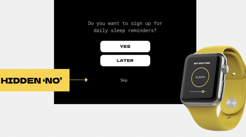
If you’re ever annoyed by a website or app trying to trick you by using small text, brightly colored buttons, or tricky toggles, there’s a new tip line you can use to report the bad behavior, run by Consumer Reports Advocacy. The Dark Patterns Tip Line aims to collect various examples of dark patterns, defined by the website as “design tactics used in websites and apps to persuade you into doing things you probably would not do otherwise,” and use those examples to fight back against the companies that are behaving poorly.
Even if you’ve never heard the term “dark pattern” before, you’ve likely come across one. Consumer Reports provides a list of examples in a tweet, and on the tip line’s site, but there are entire websites (like darkpatterns.org) and subreddits dedicated to showing examples from across the internet. Former president Donald Trump’s campaign even used them to trick supporters into donating way more than they intended.
#DarkPattern examples:
-You can’t exit an ad because the “X” is so small
-You try to buy something and a site sneaks an extra item into your cart
-You’re forced to provide your phone number to register a new account
-You’re silently charged for a subscription after a trial ends— Consumer Reports Advocacy (@CRAdvocacy) May 19, 2021
There has been some legislation around dark patterns, with California banning ones that trick users into giving away private information earlier this year, but it’s still an area where government has been slow to step in. Consumer Reports hopes to, in part, use the submissions from the tip line as evidence when speaking to lawmakers. It also hopes the site will help inform consumers about how to avoid the unscrupulous designs, and hold companies accountable for their actions.
If you want to see other people’s submissions to the tip line, you can go to its Sightings page, and if you have a submission yourself, you can go to the Report page.


