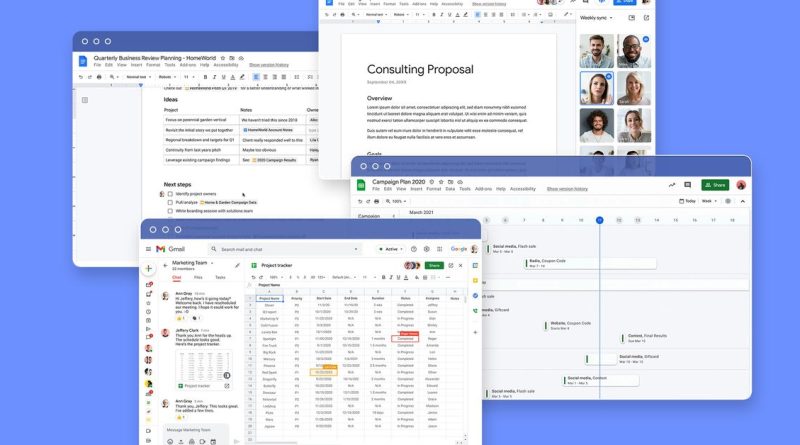
Google Workspace turns to “smart chips” to weave Docs, Tasks, and Meet together
Google is launching a slate of new features for its Workspace productivity suite today, starting with new “smart chips” that connect Google Docs to other products. Just like you can tag people with an @ symbol, starting today, you can use it to specialize links inside docs that hook up other files or meetings. They’re part of what Google is calling the “smart canvas,” a new initiative that promises to increase the cadence of product improvements for Workspace.
The idea behind the smart canvas is similar to workplace productivity suite dreams that reach as far back as OpenDoc in the ’90s: having smaller bits of information like charts, text, and images become more modular and interconnected. It’s not dissimilar to Microsoft’s Fluid Office document project, which launched last year.
Ultimately, Google is working to make every single part of its Workspace suite of apps interconnected. You’ll be able to start a Meet video chat directly within Docs or share your Doc directly into a Meet call with a button in the doc. All of that integration will be useful, but it also has the benefit (for Google) of perhaps enticing users away from using competing products like Zoom or Slack and instead using Google’s cohesive suite.
There is a smattering of other small updates: emoji reactions in Google Docs in addition to traditional comments, a new timeline view in Google Sheets for improved project management, and best of all: a new “pageless” view in Google Docs that does away with the assumption that your document is meant for an 8.5 x 11 piece of paper. It dynamically resizes the doc to the size of your web browser the way a web app ought to.
Finally, Google is adding some “assisted writing” features to Google Docs, which will range from warning you about offensive language, wordiness, or noninclusive language.
Taken together, it’s a grab bag of updates, but the thing to keep an eye on going forward is the smart canvas function, which is built on a new framework for Workspace apps that could accelerate development.
GIF: Google
Smart chips and templates
Starting with Google Docs, smart canvas will make it easier to dynamically insert smart objects — called chips — that are linked to other parts of Google’s office suite. Google is starting small, though. At first, the smart chips will only connect with other documents, contacts, and meetings. Hovering over one of them will pop up a box with relevant information you can interact with.
To insert a chip, Google is relying on an interaction model you’re probably already familiar with: the @ tag. Type an @ symbol into Google Docs, and it’ll pop up a menu that will list a bunch of those elements, and you can type to narrow it down to the thing you want to include. Hit enter, and it will make a smart chip.
“We don’t want you to have to learn a new affordance,” says Erika Trautman, director, Google Workspace. “This is something that people know how to use and millions of people use it every day.”
GIF: Google
If you link to another document or sheet, you can scroll through that document inline in the resizeable hover box — and it should work with lots of different document types in Google Drive, including Microsoft Office docs.
The smart chips do more than simply link out or create hover boxes, too. The @ symbol can bring up custom templates for things like project management tables, complete with voting and task tracking. If you select a meeting template, it will auto-populate smart tags for the attendees and any files attached to the calendar invite.
You can also create task lists inside a Google Doc and then assign them to a contact — and if they choose, those tasks will auto-sync with Google Tasks (which, by the way, is still not getting its own website and only lives in a sidebar in other Google apps for some reason).
Google says that smart chips will also come to Google Sheets “in the coming months.”
GIF: Google
Pageless view, timelines, and other features
There is a smattering of other features being announced today alongside smart chips, many of which will probably have a more immediate impact on many people’s day-to-day work.
The pageless format in Google Docs is wildly overdue, especially considering how simple it is. It just does away with the wholly unnecessary concept of a “page break” and also makes the text flow smoothly no matter the width of the browser window. It’s arriving just in time for the 11th anniversary of Ethan Marcotte’s seminal Responsive Web Design article.
If you use Google Sheets to track projects, there is a new timeline view that can be used to track multiple overlapping tasks. Sheets will also finally get a little smarter about auto-suggesting formulas when you drag a mouse across cells — as well as offer better troubleshooting for broken ones.
There are also a bunch of integrations with Google Meet coming. Docs, Sheets, and Slides will let you present from them directly into a meeting without mucking about with screen-sharing options. Later this fall, all three will integrate Meet directly, so you can start a meeting directly within a document tab.
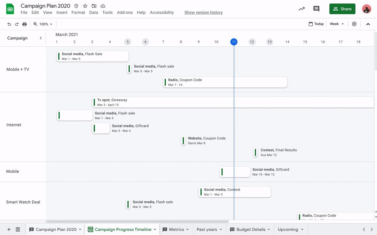
Image: Google
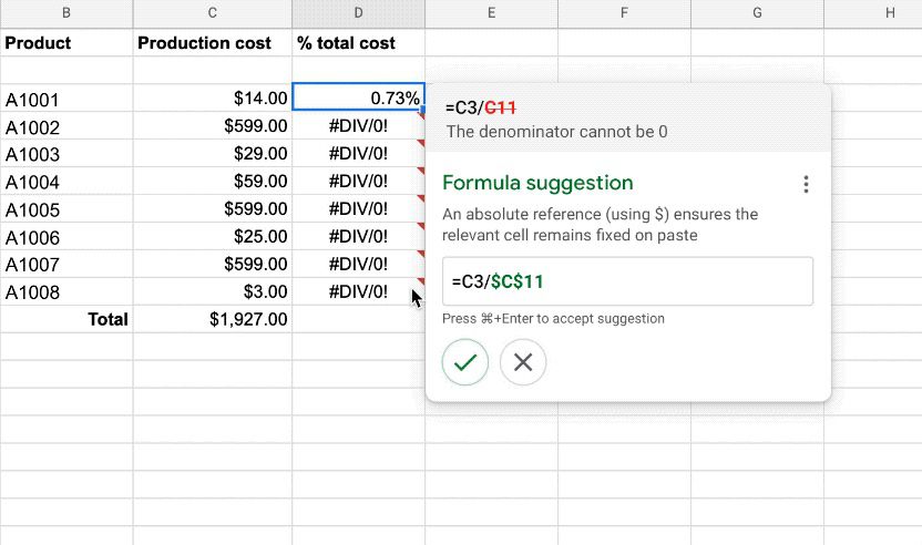
Image: Google
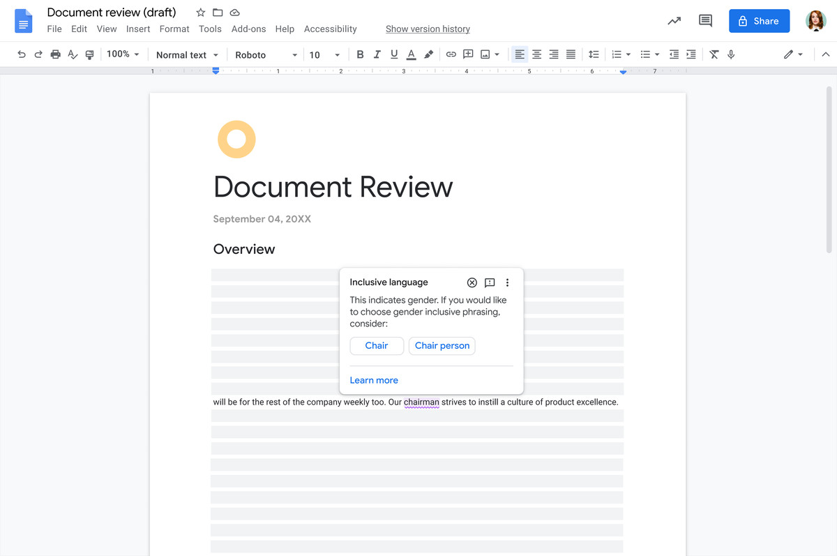
Image: Google
Docs is also getting some new options that are either wonderful, infuriating, or perhaps a bit of both. Instead of leaving comments, you’ll soon have the option to just put an emoji reaction on a paragraph.
Last but not least, add one more squiggly underline to go along with red for misspellings and green for grammar: purple for style. Google Docs will be able to make suggestions about different kinds of writing style issues ranging from the genuinely important (suggesting inclusive language like “delivery person” for “mailman”) to patronizing (suggesting “to” for “in order to”) to the downright Victorian (underlining swear words). It’s similar to Grammarly and Microsoft Editor.
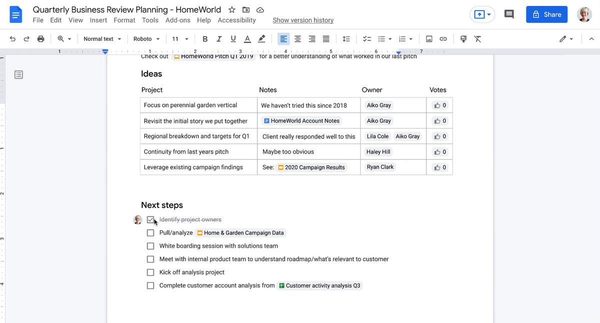
Image: Google
Workspace and the web
Last week, Google put up a blog post announcing that “Google Docs will now use canvas based rendering: this may impact some Chrome extensions.” That “canvas” is different from the smart canvas we’ve been discussing. I regret to inform you that we must now briefly discuss web standards, but it’s relevant.
At a very high level, canvas is an element you can put into any HTML page, and as the name suggests, it is an empty space you can use to display more complex things — like stuff built with scripts. Essentially, it sits on top of web technology, but — depending on who you ask — it isn’t made of web technology. It’s a technique for putting code on a webpage that doesn’t necessarily use the stuff you might think of as the code that makes up most of the web like HTML, CSS, and so on.
I bring this up because it caused a bit of a stir in the web community last week. One refrain is that Google is one of the greatest champions of the web and puts significant engineering resources into web technologies — and if Workspace isn’t using them for core features, that’s a bad sign at best and harmful to the development of the web at worst.
Google insists that the switchover from more traditional web code to canvas is unrelated to today’s announcements, but Trautman admits that the “shift in technology is part of what’s allowing us to innovate and bring these new affordances forward.”
At the same time, Javier Soltero, VP and GM of Google Workspace, emphasizes that Google — and the Workspaces team, in particular — contributes quite a bit to the web: “We are fiercely committed in steering the path of innovation around the web. […] These standards are really important to us. And this approach is, to us, an opportunity for us to showcase what you can do through these apps.”
It’s unclear what third-party Workspace plugins or what Chrome extensions may break in the future, but that’s true of any web app, whatever technology it’s built on. Google does say that its smart chip system will be open to other companies. “We do not want this to be a walled garden. It will be extensible,” Trautman says. “We have third party partnerships underway.”
Ultimately, the most important question may not be whether Google is using traditional web technologies, but whether Google Workspace will continue to be a real web app instead of just a Chrome app. For that to be true, it needs to be broadly compatible across many desktop and mobile browsers.
The answer to that question turns out to be fairly complicated because web standards are complicated.
Google says Blink-based desktop browsers (including Chrome and Edge) should fully support all of the features mentioned here. WebKit (Safari) and Gecko (Firefox) desktop browsers should support everything except some of the Meet features like opening a videoconference from within Docs.
Google officially supports “view mode” for mobile web browsers (though the iPad can present itself as a desktop browser and work). In general, Google wants to point mobile and iPad users to its native apps. Those apps will support many smart canvas features like smart chips, tasks integration, and the responsive pageless layout — but miss out on others like templates and the purple assisted writing squiggles.
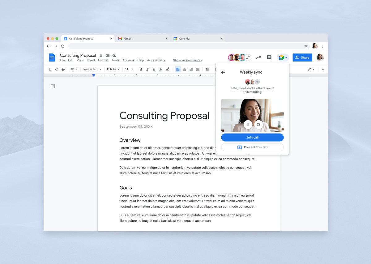
Image: Google
A coherent product roadmap. At Google. Really!
Google Workspace was on a tear in 2020, adding new features and rebranding itself from G Suite (the name you probably still associate with Docs, Sheets, and Meet products). Many of the developments were necessary (and overdue) improvements for both Meet and Chat, two vital collaboration tools for remote work.
The pandemic surely put more priority and resources behind those features, but what was remarkable about them wasn’t what they did, but how they seemed to be part of a larger plan instead of just being haphazardly added as they occurred to a Google engineer. Even Google Chat, the Slack competitor that is the ultimate inheritor of Google’s fractured message app fiascos over the last decade, seems to have a coherent product direction these days.
It’s happened under the leadership of Soltero, who came to Google from Microsoft in 2018. He came to Microsoft as part of its acquisition of Accompli, an email client so good it ultimately became Outlook for Mobile. Now in charge of Workspace and Google’s communication apps, Soltero is methodically working his team toward a new vision for Workspace. The vision seems to be more influenced by trendy productivity apps like Notion than by Microsoft Office.
In fact, in speaking to Trautman or Soltero, asking even simple questions like how a Docs smart chip could create a Google Task leads quickly to heady discussions around product design and the future of collaborative work. “We want all of that to be under the hood and completely invisible,” Trautman says. “We want that behavior to, from a user perspective, to know what you intended and to do what you intended.”
“The technical complexity […] isn’t as important as the sense of restraint and predictability you have to deliver to users,” Soltero adds. For Google, it was a conscious choice to start with Docs and build from there, rather than create an entirely new product or system for collaboration. It’s trying to meet users where they already are and build on that.
There are limits to that approach, but it definitely makes the new features more approachable. The Workspace team is deliberately trying to help users build new habits organically rather than foist an entirely new framework for understanding how productivity software could work on them. Notion, to cite that example again, is incredibly rich and powerful if you’re able to dive into that system and spend the time it takes to learn it, but Workspace is a giant product with a giant user base that can’t get there right away.
As for some future system that actually presents all of these interconnections, tasks, and documents in a new dashboard? Soltero says: “I don’t want to spoil the rest of our roadmap,” but “there are many examples of decisions you could make to aggregate these things and the decision about whether you create yet another surface… I think restraint actually is not only the right call, but it is more characteristic of what has made Google successful.”
In other words, if you were hoping this new interconnected and collaborative smart canvas portends the return of Google Wave, it does not.

