New leak ahead of Google I/O claims Android 12 may include changes for widgets and notifications
Just ahead of Google I/O, which gets underway on Tuesday, a new leak purporting to be a preview of what’s coming during the annual developers’ conference gives some insight into what Android 12 might look like. A new video from Jon Prosser shows what appear to be slides from a presentation of Android 12.
The first slide sets up what to expect: “A beautiful new experience,” “Stronger privacy and security protections,” and “All of your devices work better together.”
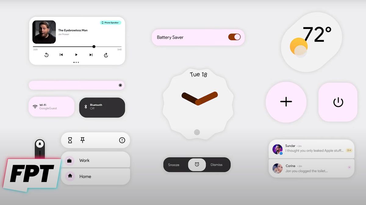
The usual caveats about leaked materials apply, of course; there’s no guarantee this is what the final interface will look like, or how much may be announced during I/O. But the most interesting slide in Prosser’s video shows what appears to be a new user interface for Android 12, including a new media widget, a brightness toggle, a weather widget, an analog clock widget, a snooze/dismiss toggle, and stacked notifications (in the lower right corner of the screen grab):

Previous leaks of Android 12 have shown stacked widgets, which look similar to the Smart Stacks introduced in iOS 14. We’ve also seen earlier leaks via XDA Developers that showed new themes and a conversation widget for Android 12. And Google’s own developer previews of Android 12 have included a lot of small tweaks and developer-focused features, while hinting at some significant UI changes that have been rumored, including the stacked widgets and a new lock screen with larger clock text.
Prosser shows a what he says is a video from I/O that shows updated notifications, a new keyboard design, and a new lock screen with a larger clock, which seem to confirm the earlier leaked info.
If the details in the latest leak roundup are accurate, Android 12 could be the biggest overhaul of the OS in several years. We’ll find out more in a few days when the annual I/O conference kicks off.


