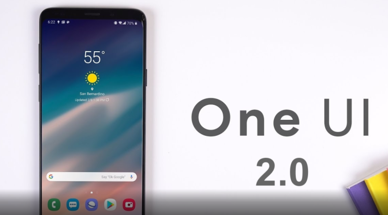
Samsung One UI 2: From features to functionality, here’s what makes the Android 10-based OS interesting
The last year and a half have seen Samsung up its game in the smartphone market, and one of the biggest contributing factors behind the company’s improved performance has been its move away from the Experience UI.
Towards the end of 2018, Samsung overhauled the core code for the user interface of its phones and as a result announced the first version of One UI based on Android 9 Pie. The OS not only brought with itself new features but also made Samsung’s software for smartphones much slicker than ever.
But most importantly, One UI excelled the most in making the operating system feel more interactive and by improving the users’ access to important information and actions within the interface. But while the operating system generally impressed with its changes, it truly wasn’t the finished article.
A few rough edges here and some frustrating issues there ensured that the One UI could still not be considered a true joy to use.
But a year on, when Samsung unveiled the One UI 2, its take on the latest Android 10 operating system, it worked towards refining the original One UI and adding functionality to it that makes it more user-friendly.
The software has been available in a stable form on the flagship, Galaxy Note 10 and S10 series of phones for a while now, and it is scheduled to be made available on other Samsung devices too in the coming weeks.
Over the last two weeks, we’ve had the chance to try One UI 2 on Samsung’s Galaxy Note 10 Plus, and here’s what we think about it.
Easy on the eyes
One of the first things that you notice the moment you lay your eyes on the interface is just how easy to look at it is. Much like its phone, One UI 2 appears to have been designed to be easy on the eyes and more visually pleasing than stock copies of Android 10 and all of this while ensuring the software looks clean and bloat-free.
What also helps improve the visual experience on One UI 2 is the interface’s ability to provide the user with new gesture controls that come with Android 10. Because of this, there are no digital buttons at the bottom of the phone, and the home screen, app drawer, as well as browsers on the app, look cleaner than ever before.
There is also the inclusion of the dark mode that helps make the interface feel much better to look at. While stock and close to stock Android solutions are often better suited for user needs, Samsung’s One UI 2 bucks that trend as it manages to add a touch of premium to the otherwise functional software that Android is.
Enhanced functionality and improved performance
Another thing of note with the Android 10-based One UI 2 is that it brings enhanced functionality over last year’s One UI. The software focuses on making the upper screen cut out for viewing content, while the lower area of the screen appears to have been kept for apps.
The Quick Setting page also appears more simplified than before, with necessary buttons and toggles all available for quick access. On our Note 10 Plus, a simple swipe down reveals toggles for important functions including WiFi, Power Mode, Wireless PowerShare, NFC and more.
The enhanced functionality also sees One UI 2 bring a better system-level dark mode. While in the previous iteration it was limited to Samsung’s applications, the dark mode on One UI 2 brings it to third party apps too, making it more usable.
The refinement in the code of the One UI 2 has also helped to improve the performance of the device. While the Note 10 Plus is anyway a snappy device, we noticed animations feel much smoother on the device than before. Battery life too is another area where the new software shows some improvement. While not too much, there is definitely some level of improvement in battery endurance that has been brought about by the new OS.
Having said that, it would be interesting to see if One UI 2 can maintain this level of performance going forward — or if its code eventually fails to RAM management issues after a few months of use.


