
Mobile SEO : the complete guide for Mobile SEO
Mobile Optimization
Mobile optimization is the process of ensuring that visitors who access your site from mobile devices have an experience optimized for the device.
What is Mobile Optimization?
Every year people spend more and more time on their mobile devices and tablets, but many websites still aren’t designed to account for different screen sizes and load times. Mobile optimization takes a look at site design, site structure, page speed, and more to make sure you’re not inadvertently turning mobile visitors away.
key issues you must consider for Mobile SEO
Mobile SEO refers to the search engine optimization of websites combined with flawless viewing on mobile devices, such as smartphones and tablets. Thanks to the increasing boom of portable devices, webmasters should be highly concerned with their mobile SEO plan. After all, more than 50% of Internet users now report surfing websites through their mobile devices daily. Google is already favouring mobile friendly sites.
Based on my experience of different mobile SEO projects, I have created this detailed guide on mobile SEO. I hope it will help newcomers to mobile SEO missing some of the key issues. Below I will spend time offering my recommendations to boost your understanding on how to properly optimize your website for optimal user experiences across all mobile devices.
First and foremost, according to Google mobile websites typically run on one out of three different configurations:
- 1. Responsive Web Design
- 2. Dynamic Serving
- 3. Separate URLs
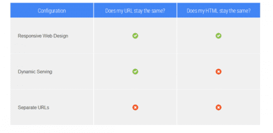
Note: It’s critical that Google can clearly understand your website’s mobile setup and which of these three configurations you’re using.
- Responsive Web Design
When you use responsive web design, your mobile site will have the same HTML code and content for the same URL regardless of the user’s chosen device. You’ll simply use the meta name=”viewport” tag within your site’s source course to help the Internet browser identify how they should adjust the content. Then, the display settings will change to fit each visitor’s unique screen size.

Benefits of RWD
Responsive web design is very popular among SEO experts everywhere, and it’s even recommended by Google itself. You should definitely consider responsive design because:
- It’s easy to share content from a single URL.
- Google can easily index your single URL for higher search engine rankings.
- You’ll find it convenient to maintain multiple pages for the same content.
- This design avoids common SEO and formatting mistakes.
- There won’t be much additional setup time.
- Googlebot will use less resources and make crawling more efficient.
- Users won’t have to deal with redirects, which offers shorter page download times.
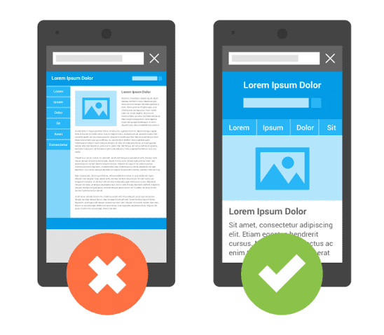
Example of RWD for mobile device – how not to do it!
- Dynamic Serving

Dynamic serving configurations are designed to have the server respond with different HTML and CSS code on the same URL depending on the user’s device. For this, you’ll need to properly use the Vary HTTP header to signal changes based on the user-agent’s page requests. Valid headers tell the browser how to display the content and help Googlebot discover that your website has mobile-optimized content much faster.
Also read : Seo top keyword reasearch tools And Long tail keywords complete guide
Responsive web design
Responsively-designed sites use CSS3 media queries to serve the same content to mobile and desktop users using a fluid grid and a flexible design to automatically adapt to the size of a user’s screen.
Responsive designs use media queries to target the layout based on screen width, orientation, and resolution. For example, you could use the following CSS to instruct browsers how to display content for a screen that’s 420 or fewer pixels wide:
Code Sample
@media screen and (max-width: 420px) { .class { [styles for this class here] }}
And to link to a separate stylesheet instead, put the following HTML in between your <head> tags:
Code Sample
<link href="mobile.css" type="text/css" media="screen and (max-device-width: 480px)" rel="stylesheet"/>
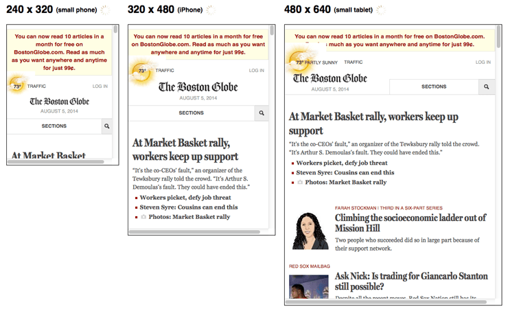
Responsive designs allow you to have a variety of these media queries so that users on tiny mobile screens, larger-than-average mobile screens, and even tablets can all see a site that looks designed for their devices.
Use a Google’s Mobile Testing Tool to verify that your website is optimized for mobile.
Separate URLs

As the name suggests, this setup configuration involves having different URLs for your website to successfully display your content on different mobile devices. Each URL is equipped with different HTML code for every respective screen size.
[amazon box=”B07VJ92G95″ “small”]
Avoiding common mistakes in mobile SEO
1. Don’t block Javascript, CSS, and image files
It’s common for some developers to block some of the Javascripts, CSS, and image files on their website, which is actually against Google’s guidelines. The best approach is to keep all files visible to the search engine’s crawlers. You should also:
- Use ‘Fetch as Google’ through the Google Webmaster tools to guarantee your website’s CSS, Javascript, and images are completely crawlable.
- Check robots.txt to make certain you’re not hiding any pages from Google.
- Ensure any redirects to separate URLs are functioning properly according to each mobile device.
In the old days, some mobile devices couldn’t support all of these elements, so webmasters of mobile sites blocked one or all three. But for the most part that’s no longer true, and the Smartphone GoogleBot wants to be able to see and categorize the same content that users do. So don’t hide it. These elements are also critical to helping Google understand if you have a responsive site or a different mobile solution.
2. Optimize unplayable content
At times, video content available in a desktop version can’t properly run on mobile devices, which doesn’t lend for a good user experience.
It’s suggested that you use HTML5 for video embedding on all animations to improve your website’s usability on all devices. Plus, you should avoid flash to maintain content that’s easy for search engines to understand.
3. Fix faulty redirects and cross links
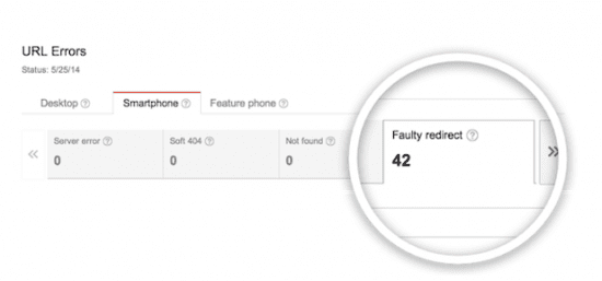
As you would for your standard desktop version, carefully remove your crawl errors found in the Google webmaster tool.
You should plan for a regular website health check to make sure your mobile-friendly design is always operating correctly. Well-maintained websites always perform best when vying for spots on Google’s search engine result page.
4. Steer clear of Mobile-only 404s

Some websites serve content to desktop users but show an unsightly 404 error page for mobile users accessing the same URL. Since this is awkward for mobile visitors, it’s recommended that you redirect them to an equivalent mobile page at a different URL instead. Make sure your mobile-friendly page is properly configured to avoid ever showing an error message that will turn away potential business.
Also Read : most important SEO tips for higer ranking And secrets of article writing
and what is page speed and total guide and what is follow links
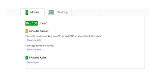
5. Keep your site lightning fast
Page speed
Because of hardware and connectivity issues, page speed is even more important for mobile users than desktop users. Beyond optimizing images, you’ll want to minify code, leverage browser caching, and reduce redirects.
6. Use ‘Rel=Alternate Media’
Taking advantage of ‘Rel=Alternate Media’ attribute will enable you to easily map your desktop and mobile URLs. You’ll need to add this to the desktop version of your website to specify the mobile version, but doing the opposite is never recommended.
Separate mobile URL
Another option is to create a second, parallel site for mobile users. This allows you to create completely custom content for mobile visitors. To avoid URL confusion, most parallel mobile sites use an “m” subdomain.
Parallel mobile sites can be as imperfect as dynamic serving sites at sending visitors to the right version, so be sure to make it easy for visitors who end up in the wrong place to click over to their preferred experience.
You’ll also want to make sure that your site redirects are all in place and as lean as possible to decrease page speed. And to avoid duplicate content issues, you’ll need to set up rel=”canonical”.
7. Add the “Vary:User-Agent” HTTP Header
Whether your website redirects based on mobile device type or simply shows different content from dynamic serving, it’s advised that you configure your server to return the ‘Vary:User-Agent’ HTTP Header. Even if your redirects are running correctly, this will help keep everything mobile SEO-friendly and running smoothly.
Vary HTTP Header
GET /page-1 HTTP/1.1Host: www.example.com(...rest of HTTP request headers...)HTTP/1.1 200 OKContent-Type: text/htmlVary: User-AgentContent-Length: 5710(... rest of HTTP response headers...)
Example from the Google Developers Blog.
Simply put, this means that the content displayed will vary based on the user agent requesting the page.
Dynamic serving is not the perfect compromise that it might seem to be. For one, it relies on having an updated list of user agents, which means that every time a new mobile device comes to market that list needs to be updated. And it’s not uncommon for desktops and mobile devices to be wrongly served with the HTML for the other device.
8. Use ‘Rel-Canonical’
Canonical tags are used to avoid issues with duplicated content. Adding the ‘Rel-Canonical’ tag onto your website’s mobile version will help Google properly index all pages and avoid flagging any unoriginal content. This will also prevent confusion by consolidating indexing and ranking signals, such as external links.
9. Optimize Titles and Meta Descriptions
Since mobile devices have smaller screen sizes, it’s important to keep your website’s information as concise and meaningful as possible. Make sure you follow all on-page factors like titles and meta-descriptions with keyword-rich content for the best SEO results.
[amazon box=”B00SZ637QA” “small”]
10. Use Structured data
Individuals surfing through websites on their mobile devices don’t want to wait around for any new windows to open. Users and Google prefer fast-loading, lightweight websites that efficiently open in just a second or two. Check your average download time through the page speed tool and fix any delaying errors you find.

With the small screen size, search results with rich snippets typically receive more clicks and drive higher click-through rates onto your website.
After the Hummingbird update, structured data become very important for boosting Google ranking factors
11. Take advantage of local searches
Thanks to GPS, local businesses tend to get the most mobile traffic that turns into desktop traffic and sales. Thus, it’s critical that you optimize your website for local searches by adding in your company’s name, address, phone number, and call out actions.
12. Build mobile sitemaps
Last but certainly not least, create an XML sitemap for your website’s mobile version. Keep your mobile pages separate from the desktop ones to quickly identify any indexing troubles.
Benefits of Mobile-friendly designs
Overall, when you invest in giving your website a makeover with any of the three mobile SEO configurations, you can look forward to:
- More website traffic
- Improved user experiences
- Higher conversion rates
- Increased time spend on your website
- Lower bounce rates
- Faster page loading times
- Competitive market advantages
- More customer engagement
- Improved search engine performance